What is Styled Components?
As the name itself says styled components is a component-based styling tool. It is powered by tagged templates and allows to create react components with styles.
What does it cater to?
- Auto prefixing
- Reverse selectors
- Built-in Theme compatibility
- Nesting
- Uses unique classes
- Using styled-components supported libraries, such as styled-material, bootstrap styled and many more
- Loads only the required styles for the displayed page
Installation
- Navigate to your components root
- Run
npm install -save styled-components - To start using open a component and import
import styled from 'styled-components’
Styling
I’ll show this with an example. Let’s style our website header section
<Header>
   <MenuWrapper>
      <MenuItem>Home</MenuItem>
      <MenuItem>About</MenuItem>
      <MenuItem>Contact</MenuItem>
   </MenuWrapper>
   <Logo>Site Name</Logo>
   <HeaderRight>
      <Login>Login</Login>
   </HeaderRight>
<Header>

const Header = styled.header`
  display: grid;
  grid-template-columns: 1fr 100px 1fr;
`
const MenuWrapper = styled.nav`
  position: relative
`
const MenuItem = styled.a`
  color: black;
  padding: 10px;
  display: inline-block
`
const Logo = styled.div`
  font-size: 2rem;
  color: red;
`
const HeaderRight = styled.div`
  text-align: right
`
const Login = styled(MenuItem)`
  color: white;
  max-width: 80px;
  background-color: black;
`
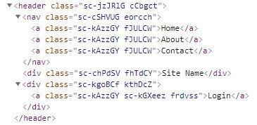
And this will be rendered as below;

Styles will be added inside the style tag in the head

Defining Variables
export const Colors = {
 black: ‘#373436’,
 gray: ‘#b1bfd0’,
 white: ‘#ffffff’,
 yellow: ‘#ffb721’,
 red: ‘#f2405d’,
 blue: ‘#5f93e7’
};
Using variables
button {
 color: ${Colors.white};
 background-color: ${Colors.red}
}
Global Styling
You must be wondering how am I going to write my global styling with styled components as this is component-based. Before you worry, the developers have provided us with createGlobalStyle function.
Using Global Style
import styled, {createGlobalStyle} from 'styled-components'FullwidthWrapperexport const GlobalStyles = createGlobalStyle`
  body {
    font-size: 13px;
    color: black;
       a {
         color: blue
       }
  }
`
Props
Styled components can identify values passed through attributes. For example, we can pass these <Header grid col_s={"1fr 100px 1fr"} /> This will be passed through our styles.
${props => props.grid && css`
  display: grid
`};
grid-template-columns: ${ ({col_s}) => col_s ? col_s : '1fr' };
In this case, if the grid is passed through a prop, it will understand it and apply the style as display: grid
Do check out the Zen-styled component project to style your web app simply.


Leave a comment